// Overview · Case study 01
PartyLife Events SaaS
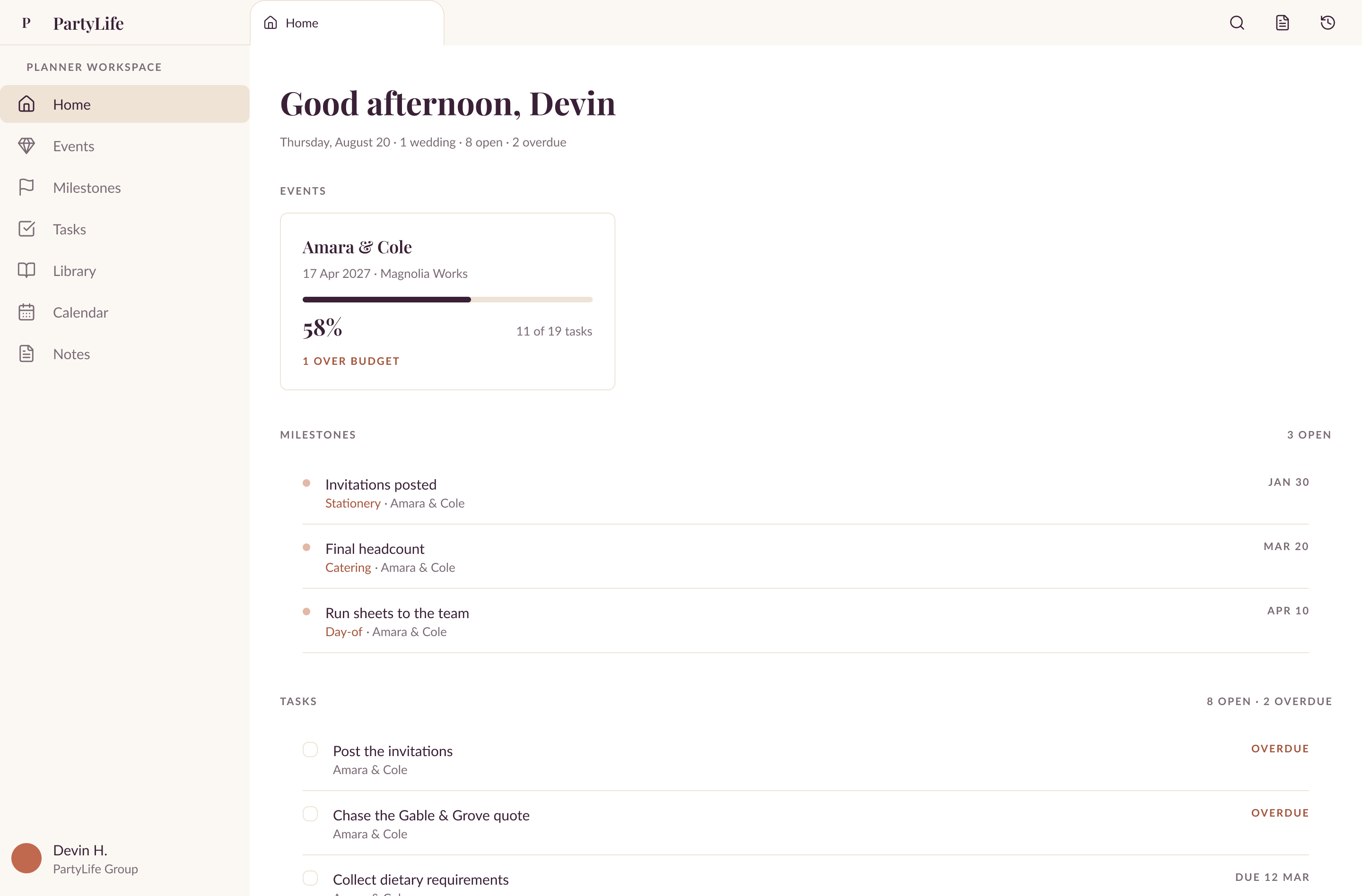
PartyLife Events is a wedding focused event business. I designed an internal tool that gives their team one source of truth for planning a wedding from end to end, for every stakeholder involved.
// Discover
The notebook, the head, and the spreadsheet
Tools
- Claude
- Granola
- Obsidian
 Claude
 Granola
 Obsidian
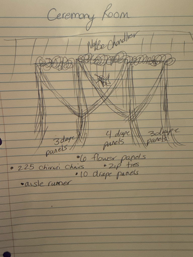
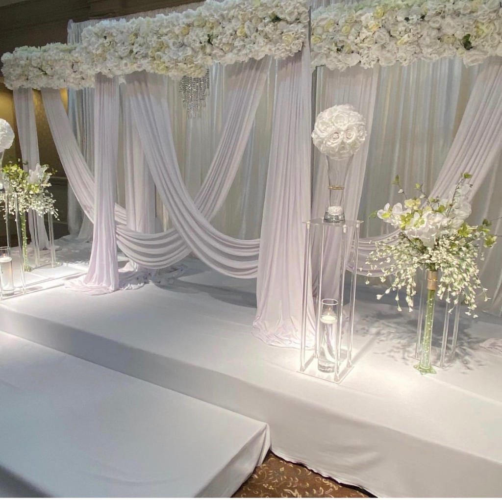
PartyLife Events is an event business focused primarily on weddings. Their biggest problem was that everything lived in three places: the owner's head, her personal notebook, and a Google Sheet. They also run an equipment rental side of the business, so the wedding side needed one source of truth of its own to keep running smoothly as the company grew. They had already tried building something themselves with AI, but they needed it to look and work well in practice. That is where I came in. They needed something usable as soon as possible, with any extra features added later. So I got to work.
I ran this project inside Claude Cowork so I had one source of truth while I worked. I started with a survey of the 3 stakeholders to get quantitative signal first, drafting the questions from my own research into their company and the wedding industry. Once their answers came back, I moved to interviews to get the qualitative side: what their real pain points were, and why they answered the survey the way they did.
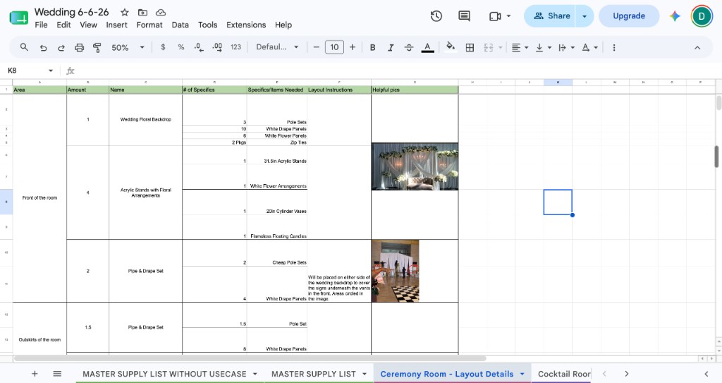
During interviews I had Granola take notes so I could focus on listening, asking follow up questions, and writing down only the things that really stood out.
I documented as I went by connecting Obsidian to Claude through MCP. I also fed the Granola notes and my own notes into Claude the same way, which is how I got to my problem statement and my next step in the process.
// Define
No shared system, from beginning to end
Tools
- Claude
- Obsidian
- Figma
- Linear
- Mobbin
 Figma
Figma Linear
 Mobbin
After the survey and interviews, I cross referenced all of the data to find the recurring issues and get to a problem statement. The core problem: there was no shared system for planning a wedding from end to end. PartyLife Events' wedding planning process runs on one person's memory. The owner holds client details, decor vision, and vendor info in her head and a personal notebook. There is no structured way for that information to reach the person who actually builds out the event, so it arrives late, or wrong, or not at all. From there, every wedding starts from zero: a brand new spreadsheet, rebuilt by hand, to plan out decor and room setups.
That spreadsheet works for planning, but it was never built to travel to the team on site, and the cracks show up on event day every time. Equipment gets left behind. One forgotten piece of decor meant a 90 minute round trip to retrieve it, mid celebration. Setup crews finish a task and stall, interrupting leadership to find out what is next, because nobody owns a defined area. Takedown starts before the event has even ended. The fix is not a bigger system. It is replacing that one hand built spreadsheet with something built to survive the handoff and travel to a phone on site.
With the problem established, I wrote the PRD, and from the PRD I built the sitemap and user flows. Alongside that I did market research for inspiration and feature comparison using the Mobbin MCP connected to Claude. Everything Claude produced was saved back into Obsidian for documentation. Linear held the tickets and acted as a second source of truth, also connected through MCP. The sitemap and user flows were built in FigJam with Claude through the Figma MCP. Now it was time to design.
// Develop
Three versions of every screen, then one
Tools
- Claude
- Obsidian
- Linear
- Figma
- Wispr Flow
 Wispr Flow
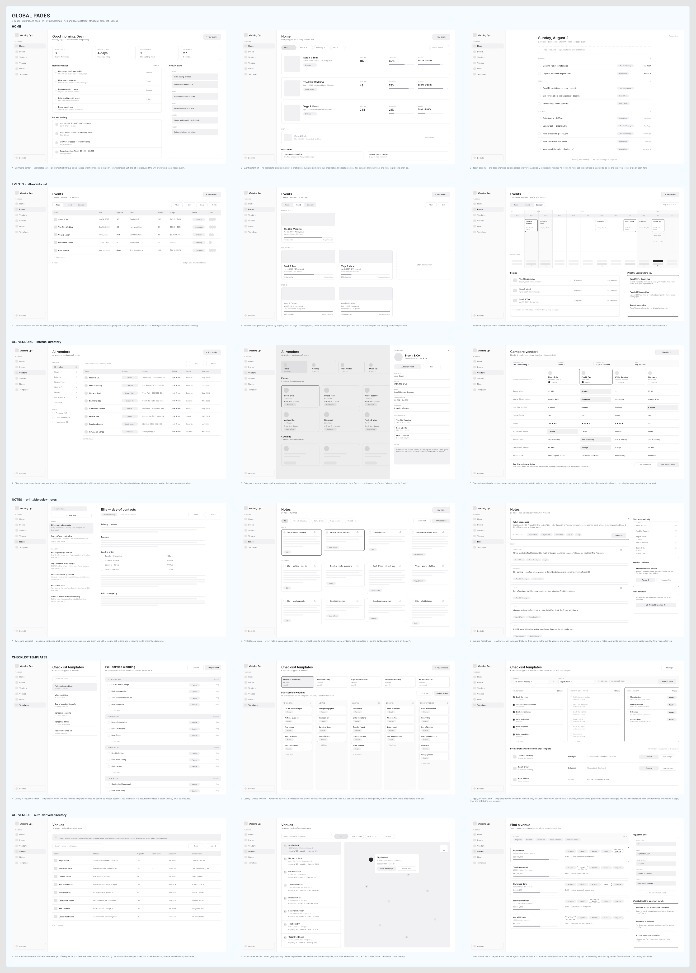
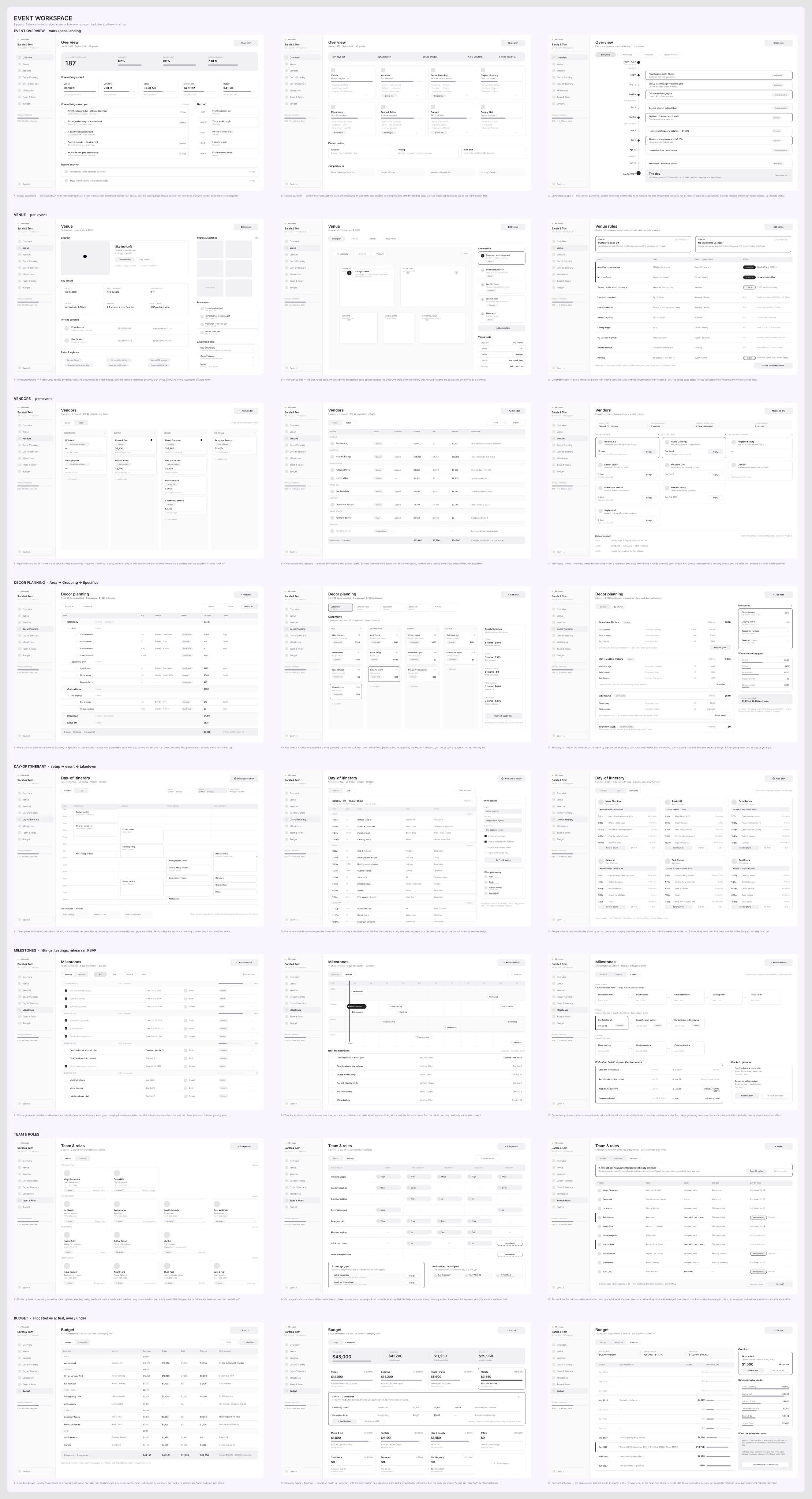
Now I could design. I took everything gathered in Define, put it into a single prompt for Claude, and asked for 3 low fidelity iterations of every required page. Once those generated, I picked what I liked and did not like from each version of each page and built a final design. I worked through it out loud with Granola recording for each set of iterations, then had Claude pull that recording, plus my written notes, to produce the final version. That gave me final designs for the global screens and the event workspace screens. I still did manual work on top to get spacing and hierarchy right. A few extra screens were needed to bridge gaps in navigating the tool, so I ran those through the same process.
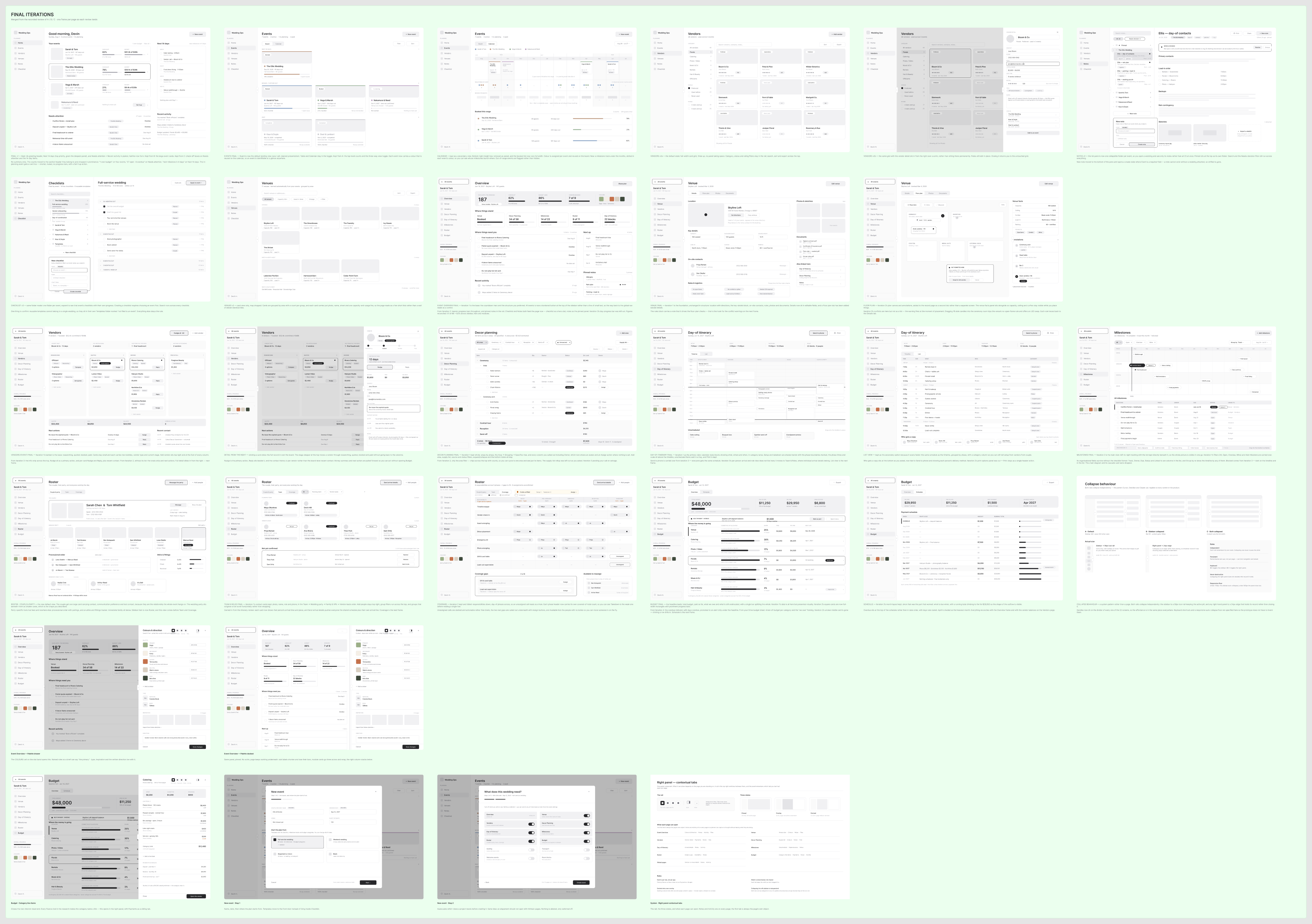
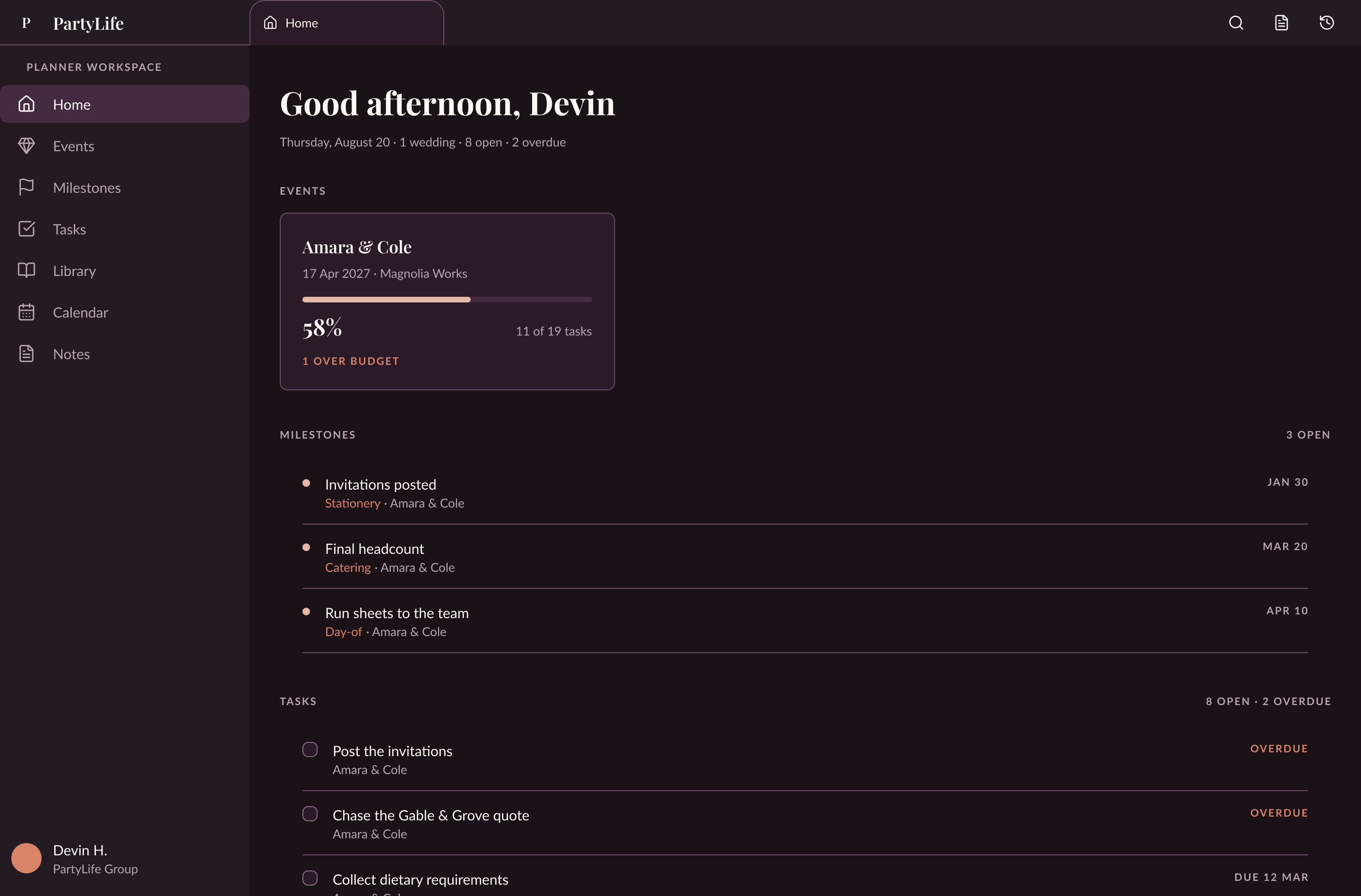
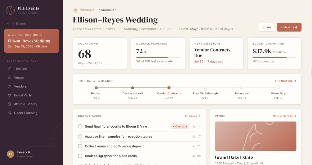
With the low fidelity design complete, I applied the design system. I did not have to build one, since they already had a brand kit from their website. I did check it against accessibility and readability standards, and it held up. Tabs work like Chrome tabs so users can jump between event workspaces quickly. I put the wedding colors near the bottom of the left pane so they stay visible while working.
Color took a few passes. I wanted the brand present, but people will be in this tool all day, so it needed enough contrast for accessibility without straining anyone's eyes, and it needed to read as professional. I did the same for the dark mode I created. Both stay on brand per the design system I was given. Mobile access seemed useful for the day of itinerary so everyone stays on the same page. It was not built out either, so instead the tool will send a text or email with a PDF of the full itinerary. This one may get skipped entirely.
Once color was settled, I applied it to the low fidelity wireframes to create the high fidelity ones, then wired up a full working prototype with Claude. I checked it over and it was ready. Reviewing with the team surfaced a few ideas that were either dropped or saved for v2: the right pane, mobile access, and a client view. None of them were built out far enough to ship without slowing the delivery date. The right pane came from the popup effect of clicking into a card and seeing its details. We thought it would be useful to open other information in that pane and work on two things at once, similar to Obsidian or Cursor. It was not built out the right way yet, so it moves to v2.
A client view would let couples follow the planning process. The stakeholders pushed back: they do not want clients that involved, because it generates more questions. So rather than a view, clients get emails and texts, the same approach as the team. This may also get skipped entirely. And I added onboarding so there is a defined first experience when someone creates an account. After those changes I cleaned up the files and fixed small visual issues. Claude handled a lot of the manual work throughout and moved me faster, but I checked behind it every time to make sure things landed correctly. I used Wispr Flow to prompt faster, since I can talk faster than I type. Then I explored the motion and behavior I wanted in the tool. Most of that could not be properly tested until Deliver, once it was converted into code. So it was time to deliver.
// Deliver
From Figma into a running build
Tools
- Claude
- Obsidian
- Linear
- Cursor
- Claude Code
- Next.js
- React
- TypeScript
- Lucide
- Tailwind
- Shadcn/UI
- Supabase
- Vercel
 Cursor
 Next.js
 React
React TypeScript
 Lucide
 Tailwind
 Shadcn/UI
 Supabase
 Vercel
With everything as polished as it could get in Figma, I shared the Figma file with Claude Code in the Cursor chat window and asked it to build the project in code. We wanted to ship quickly, so the stack is Next.js, React, TypeScript, Lucide, Tailwind, Shadcn/UI, and Supabase. That is a stack a product designer like me can manage directly before handing it to an engineer, if it ever needs one. Once the repo existed I pushed it to a private GitHub repo and opened a localhost server in Cursor to see it running. Plenty of things did not translate cleanly at first, but feeding the Figma file back through the Cursor chat cleaned most of it up. From there I kept testing and polishing with Cursor's design mode.
At this point the tool looks great. What is left is wiring up Supabase and deploying to Vercel. Since this is an internal tool, it needs thorough testing before I can share a live demo.
Overall this was a great project to work on. The real impact is a team that can plan weddings more effectively and stay organized on event day. My biggest takeaway is not to introduce too many new features once we are in high fidelity: one or two at most. The other is to run more than 3 iterations, since I do not know what I want until I see what I like and do not like. Somewhere between 3 and 5 is where I will land going forward. Stay tuned for the live demo and the next case study.